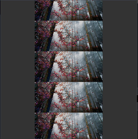
as we look at background properties Blog like background-iamge and background-color and others. but we can alot of properties in one line of code for faster and smiplifying styling. you can follow along codepen.
Note the shorthand does not work for background-blend-mode so if we apply any of the background-blend-mode value than the shorthand will became invalid.
  background-color: #333;
  background-image: url("https://source.unsplash.com/RjBXz3rtdLw");
  background-position: center;
  background-size: 50%;
  background-repeat: repeat-y;
there is not much of order as you can see above in which the values to be applied but there are certain rule that needs to followed when using shorthand.
The bg-size can only be applied after bg-postiosn and it has to seprated by '/' character center/50%.
  // shorthand for above
  background: #333 url("https://source.unsplash.com/RjBXz3rtdLw")  center/50% repeat-y;
Both will create same result you can playround in codepen.

Now there is one more rule that if you want shorthand any box values like content-box or any other for bg-origin or bg-clip if only one value is passed to shorthand than both bg-origin and bg-clip will be same.
	background: #333 url("https://source.unsplash.com/RjBXz3rtdLw")  center/50% repeat-y content-box;
	    // bg-origin = content-box bg-clip = content-boz
	background: #333 url("https://source.unsplash.com/RjBXz3rtdLw")  center/50% repeat-y content-box padding-box;
	    // bg-origin = content-box bg-clip = padding-boz
One thing about shorthand is that if we put any of the bg proprties before and than we define them in shorthand than it will be overwritten or if we apply after shorthand than it will be overwritten.
That's it for shorthand if you want more images just like bg-image you can do that. we can create gradient using bg-image or with shorthand so let's look into.
There are three ways we can create gradients.
Linear Gradients
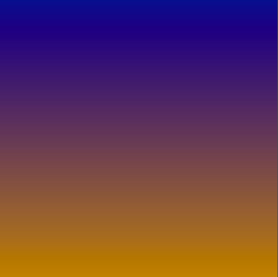
Two create linear gradient background we need aleast two colors. we can also define degree or direction value to set in which way the gradients of colors to start. let's go to syntax codepen.
background-image: linear-gradient( #3e22c3, #fdbb2d);

Pretty good looking right in above code the first color is bluis and second is yellowis. we can set colors in any manner as we want like hsl rgb rgba or hex.
what the linear-gradient will do is set the first color blue on top and yellow on bottom and it will fill on the middle with combining both colors. we can set how much value we want to give one color and also the direction in which the gradient should take place.
background-image:linear-gradient(to left, #3e22c3 50%, #fdbb2d 50%);
in above the both color will take 50% and it will start from left to right so the gradient will start from right with blue color and end with yellow. first the blue will take 50% width and than other color will take rest of the size.

since both color will take 50% no space for mixing the colors so you can change the % values in codepen to check how it creates diffrent mixes. try negative values for removing original color but to still create gradient mixes.
linear-gradient(to left,#3e22c3 50%, #fdbb2d 30%); this will not change anything because the blues takes 50% and yellow's values will be ignored unless we have another color.
linear-gradient(to left, #3e22c3 50%, #fdbb2d 50%, #fd2df2); this will create half blue and gradient. since we haven't put last color % it will divide color equally.

The Blue will not gradient with yellow because yellow and blue is 50%. we can put more % values to the color which will ending position and startgin postion for a color.
    background-image: linear-gradient(
    to right,
    #3e22c3 50% 20%,
    #fd2df2 100%
  ); // <- blue will stay solid till 50% than it will start to blend

we can also use degree and Turns for setting gradient colors.
Degrees — a value from 0deg to 360deg, where 0deg = to top, 90deg = to right, etc.
Turns are exactly what they sound like: 360 degree turns. This means that: 0.5turn = 180deg, 0.25turn = 90deg, etc.
it work in clock wise angle if we put positive values to the gradient if we put negative value it will set gradients to anti-clock wise pattern.
background-image: linear-gradient(90deg, #3e22c3 50% 20%, #fd2df2 100%);
we can alos use Transparency for creating fadding color.
	background-image: linear-gradient(
    180deg,
    #3e22c3 10%,
    rgba(253, 45, 242, 0) 100%
	); // alpha 0
Radial Gradients
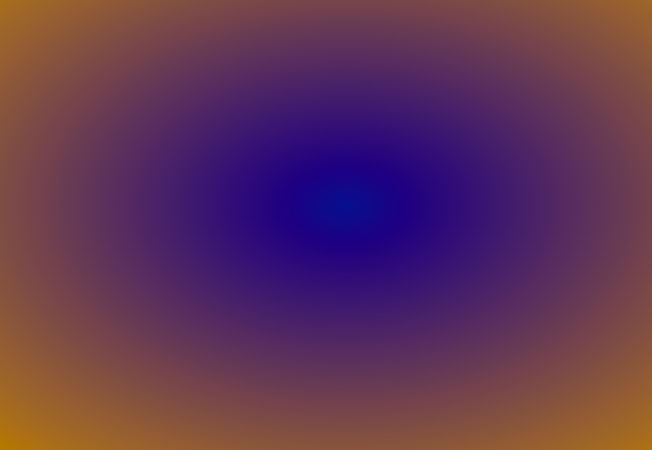
A radial gradient is defined by a center point, an ending shape, and two or more color-stop points. The space between these colors will gradually blend from one color to another with cirular objects.
background-image: radial-gradient(#3e22c3, #fdbb2d);

similar like degree and direction in linear-grad we can add value at begging to create diffrent shapes for radial gradients. let's take a look at codepen.
There three type of values we can add before the colors.
First we can set ending-shape which will set the shape of the gradient mix. in above the we haven't defined the ending-shape of the gradient so it create ellipse by default. it can changed to circle.
radial-gradient(circle, #3e22c3, #fdbb2d);
we can add position value which same as bg-position which we covered in last section. since we haven't defined any it default is center.
radial-gradient(circle at 10% 10%, #3e22c3, #fdbb2d); // without ending-shape radial-gradient(at 10% 10%, #3e22c3, #fdbb2d);
now the last value is size of the gradient. Taking refrence from MDN Docs
| Keyword | Description |
| :-------------- | :-----------------------------------------------------------------------------------------------------------------------------------------------------------------------------: |
| closest-side | The gradient's ending shape meets the side of the box closest to its center (for circles) or meets both the vertical and horizontal sides closest to the center (for ellipses). |
| closest-corner | The gradient's ending shape is sized so that it exactly meets the closest corner of the box from its center. |
| farthest-side | Similar to closest-side, except the ending shape is sized to meet the side of the box farthest from its center. |
| farthest-corner | The default value, the gradient's ending shape is sized so that it exactly meets the farthest corner of the box from its center. |
You should try diffrent values in codepen to check the deffrence it's making. depeding what you chose it will spread the gradient effect or shrink it. by default it is farthest-corner.
That's it there is one more property in to create Conic gradient but i not going to discuss that because i never used it myself and i don't think i have ever saw in any website either but if you want to know more about the conic-gradient you can read this article in MDN Link
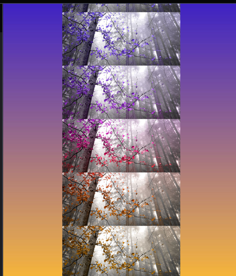
you can use bg-image stacking with gradient and create images with gradient on top.

if You want to reach out or have any thoughs on the blog or have problem here are my links Twitter or linkedin .
Other note i would highly recommad playing around in the codepen and there are two website that will help you to build gradients faster that i want to share with you.
For Simpler Use cssgradient.io. For bit complex use gradient-generator.
