We use backgroumd property to as name suggrests it change background of the element.
Follow the along with codepen it is a shorthand properites for which we about to explore.
background-color
background-color sets the color of the elements .let's get the basic background-color:red; will set the background to red color. pretty simple right.
but there is limited color strings that are recognized by the browser. so we have some other mehods for which we have some control and variance over colors.
Hex
Hex is short for hexadecimal. the syntax is pretty much same as name strings.
background-color:#123456; or background-color:#123; where 12 is red ,34 is green and 56 is blue values between 00 and ff (same as decimal 0-255).
so the background-color:red; will be background-color:#ff0000;. ff is the full internsity which will result in red background and as you go low it will less the internsity.
it works similar like how light work where #ffffff will result in full white and #000000 will result in full black. all that in between is determained by the rgb.
sometimes you can use three digit hex but only when the value of (RR, GG, and BB) are same.
for exmple #112233 can also be written as #333. also four digit hex will create transparent bg.
let's say if want alpha or opacity to color but not the element so we can add another extra
background-color:#ff0000a3; will create sility less red color background. it also works with three digits background-color:#f00a but background-color:#f00ae will not work.

rgba or rgb
background-color: rgba(0,0,225,0.2); it's works same as hex but the syntax is diffrent and we can not use alphbaes inside rgb or rbga we have to use appropriate decimal ranges from 0-255.
The a stands for apha which is same as opacity in this context. if we dont want alpha we can userrbg(0,0,225).
hsl
background-color: hsl(120, 100%, 50%); , hsl stands for hue, saturation, and lightness (HSL). hsl works bit diffrently than others. the hue value ranges from 0 to 360 where 0 is red, 120 is green, and 240 is blue. Saturation is a percentage value. 0% means a shade of gray, and 100% is the full color. it adds more grey color to hue color and last lightness is a percentage value. 0% is black, 50% is neither light or dark, 100% is white.
we can add alpha by passing extra value which ranges from 1 to 10 like opacity.
background-color: hsl(120, 100%, 50%,0.5);
Personally i would not recommand hsl unless some design choice is made, i would mostly go with hex values or rgba if alpha is needed. You can open the codepen and playaround.
background-image
it sets one or more background images on an element.
background-image: url('https://source.unsplash.com/random/?dark-nature')
In above exmple i have used an open api for

fetching images but it can be any type of url can be passed that will fetch a image or we can also user url(../pathToImage).
It will put image with width and height of the element and image will fit from top to bottom and rest of the image will be cut down. as you can see the image is not full image you can look at original image ImageLink . if we put 100vh on the element it will show more content of the image. same goes for width.

we can also add more images on stack. which ever the url is first that will get more presidance and will be on top.
.bg-image{
  color: black;
  background-image: url('https://www.freeiconspng.com/uploads/spongebob-cartoon-png-32.png'),
 url('https://source.unsplash.com/RjBXz3rtdLw');
 height: 100vh; // <- show more content
}
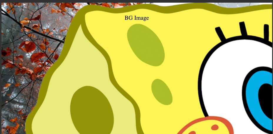
First Url is a art of spounce bob and seoncd is naturel wallpaper as we mention above the both image does not fit the container due to it's sizes.
Note : I want to mention that we can also put gradients of color using this proprty but later on that.
Now how about we set there images correctly show it's fully visable.
background-position
A position defines an x/y coordinateto place an item relative to the edges of an element's box, which means it will take that position size of the element. let's go to codepen and code. for now i have remove spounce bob url from stack for better explaing.
It can be defined using one to five values. One of the keyword values top, left, bottom, right center or % or any other units value.
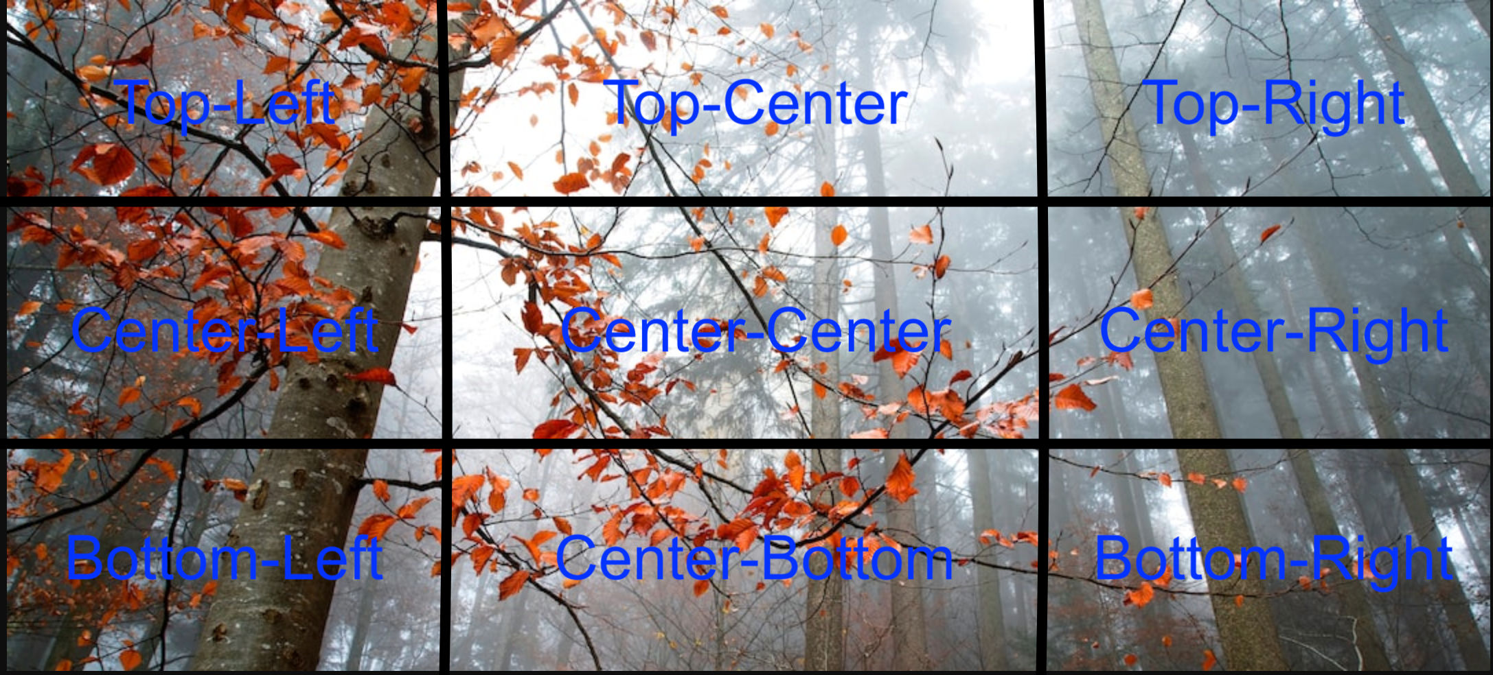
As you can see above i have spltited origin photo into nine pieaces. now let's go to syntax.
  background-position-x: center;
  background-position-y: bottom;
  background-position: center bottom; // shorthand
background-position-y:bottom; as name suggrest y-axis to bottom of image and x sets x-axis as for the background-position: center bottom; it shorthand for both where based on the value provided the axis will be decied.
    background-position: center bottom;
    background-position: bottom center; // <- same
The default values for x is left and for y is top.

you can compare result with other image and try out diffrent values and compare the changes.
now it may not be same in your screen as shown but the point i want to make is the positions will cut image based on it provided values and width of the container.
now if we put arbitray number with units it will shift that much value in respactive axis and than display the image.
  background-position-y: center;
  background-position-x: 20%;
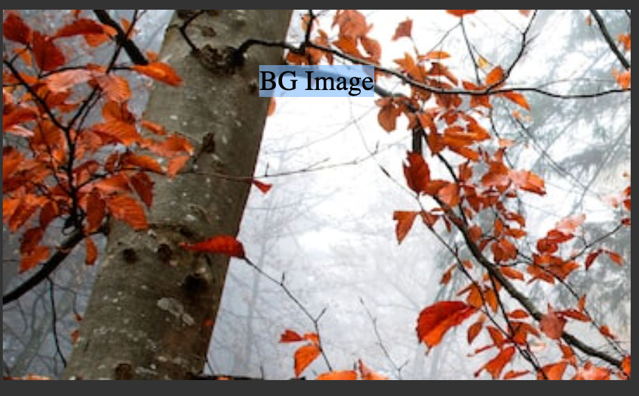
here it is center-left coner of the image with 20% shift to the image. if i put 80% than it will produce Center-right with 20% offset. you can try diffrent values in codepen
Note : top top and left right are not valid means same proprtie or opsite axis property does not work.
background-position : center will center-center the image and background-position : right; will center-right. same goes for others.
  background-position : right; // <- center-right
  background-position : left; // <- left-right
we can pass one more value to background-position proprty. Two values are keyword values, and the third is the offset for the preceding value.
background-position: center bottom 20px;

the image will set to center bottom and offset to 20px to bottom with new repeat image. Why repeat image we will talk that is next proproty.
  background-position: center bottom 20px;
  background-position: bottom 20px right; // <- same as above

  // This will not work because form center there will be not possible to offset
  background-position: center center 20px;
But there is one value we can add
background-position: top 15px right 20px;
this will cause the image to have top side with 15px offset and righ side 20px offset.
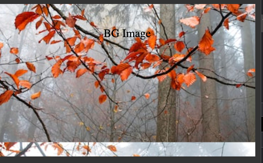
about percentage how the exactlty they are mesured i would recommed you to read this MDN articale .
background-repeat
as name suggrests it sets how background images are repeated. by default as we saw above the proprty is set to repeat but we can stop that by no-repeat let look at codepen
  color:blue;
  background-image: url("https://source.unsplash.com/RjBXz3rtdLw");
  background-size:contain;
  background-repeat: repeat;
if we remove the background-repeat it will give by default on repeat. which will repeat on both x and y but it will not repeat on x in this case because the width of the image will fill the container. adn we have put background-size:contain; but later on that.
![[Screenshot 2022-09-02 at 9.43.12 AM.png]]
We have repeat-x of only x repeat repeat-y for only repeat y. there is two of more values.
space which will make the image is repeated as much as possible without clipping. The first and last images are pinned to either side of the element, and whitespace is distributed evenly between the images. in this case background-position will be igored if it images need to cliped.
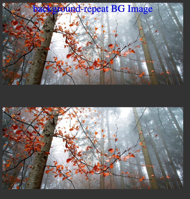
With round the images will fit the size with out cutting. by reduceing the size or reducing the number of repeated images.

background-size
it will set as name sugggets size of the image. follow along with codepen .
  height: 100vh;
  background-size : 50%;
  //                X will only apply
  background-size : 50% 50%;
  //                X    Y both will apply
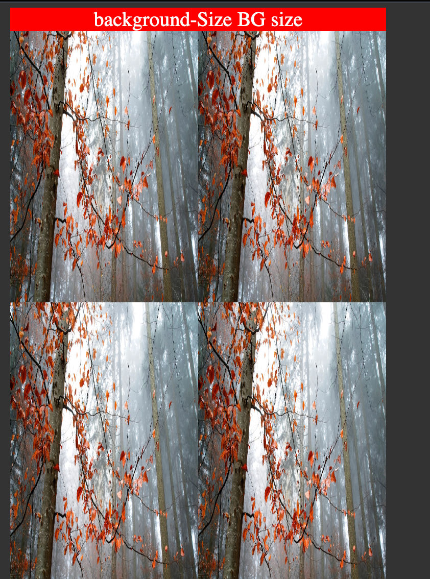
background-size: contain; as we saw background-repeat in section will spread image to it's width and the height will be auto calculated by width and than image will be repeated based on the background-repeat.
There is one more property which you properly have used or saw in background shorthands.
it's background-size: cover; which will pit the image fully on the element container.
Note: With cover value background-repeat will work because the image will take all the space of the container.
Now We have go through alot but stay with me we are about create amazing Headings. there are just few proprties are remaining.
background-clip

Looks goods right well let's look at code codepen . Now note that when you open the codepen it you can see that i have set two properties
	background-clip: text;
	-webkit-background-clip: text;
	color: transparent;
The resone for -webkit is we still need to add -webkit to use the proprty in chromium browsers.
background-clip: text; will clip the background and expcet text on the container and when we make color: transparent; will look like Image color texts. There are three more proprties border-box | padding-box | content-box.
border-box is the default which will not do any change. border-box and content-box is same as box sizing as we dicuss in [Box-Sizing Blog] but the image will be cut accordingly. padding-box will add on padding of the container and than cut the rest of the image.
background-origin
background-origin defines how the background should start where after the border , padding or the content of the element. it's works similar way background-clip but rather than cutting the image it defines where the image should start from.
	background-origin : border-box;
	background-origin : content-box;
	background-origin : padding-box;
background-attachment
sets whether a background image's position is fixed or scrollable with in container. let's go to code codepen.
It's will fix the image to position so it wil give you like parellex effect.
Note fix will not work with background-clip: text; and the container will not be scrollable
scroll
The background is fixed relative to the element itself and does not scroll with its contents.
local
The background is fixed relative to the element's contents. If the element has a scrolling mechanism, the background scrolls with the element's contents.
background-blend-mode
now let's come to last proprty but quite fun i would say😎. it sets how an element's background images should blend with each other and with the element's background color. let's look at open the codepen .
	background-color:red;
	background-blend-mode: difference;
	background-blend-mode: difference, luminosity;
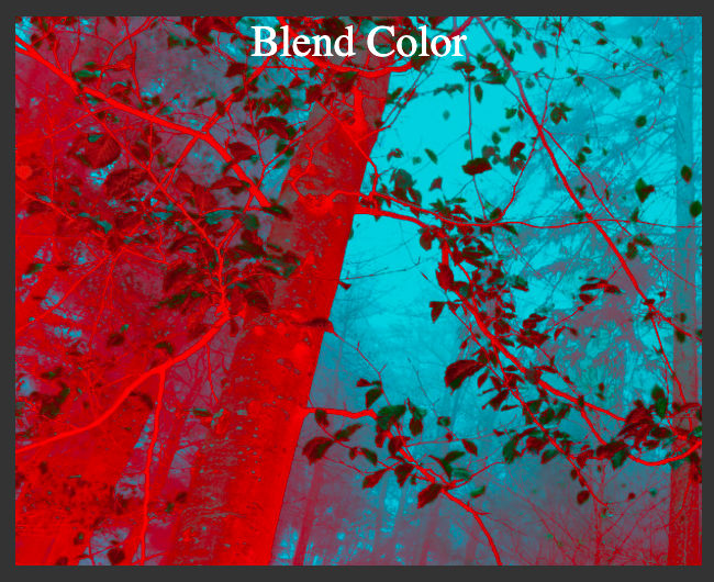
another use case would be put background-color with dark color and background-image
put background-blend-mode: difference; this can replace :after selector and creating dark shadow on image.
    background-color: #333;
	background-blend-mode: difference;
    background-image: url("https://source.unsplash.com/RjBXz3rtdLw");
Looks good right your can try diffrent values to see changes. Try with multiple images.
Now there only one thing which is left to do which is shorthand proprty called background which let you difine alot of above property into one line of code and let's us use gradient function for creating gridient background colors and mix with other values like background-blend-mode.
I am going to explain shorthand and gradient function in next blog, this one was quite a big one. i initally thought that i might go in 1 blog but i think it will be better in splits.
Hope you enjoy the reading and if you want to have something to correct or feedback or just want to ask for help you can reach out to me on Twitter or linkedin though i personally prefer Twitter.

