Text and font properties
we are goint through text proprties that we can use to create amazing looking websites with good color contrast. so let's get started codepen.
  width:300px;
  height:50%;
  margin:auto;
  color: #fff; // color of text

  text-align: center; // where alignment in container

  text-align-last: right; // last line of the paragrah aligment

  text-indent:70%; // space for the first letter.

  text-transform:capitalize; // first CH of word uppercase
  h1{
    text-decoration: line-through red; // it will make line on text
    text-transform:uppercase; // all the text to uppercase
  }

  text-align:justify;
  text-justify:inter-character; // does not support chrome
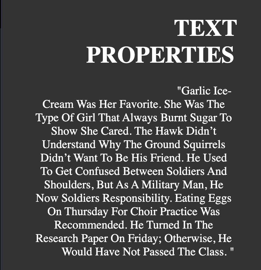
above code will generate this. now let's get to explaining text-align will align how the element should align itself in the container. the diffrent values like center, left, right and others which you can tryout.
I would recommand try commiting all the proprties and apply single one by one to see changes.
now as for text-align-last the values will be same as text-align but it will only traget the last line of the text so in above image PROPERTIES should normally will be left but we have set text-align-last to right so the it's positioned just below the TEXT and same goes for Would Have Not Passed The Class.
text-indent set's the value how the first letter should start from so we can put any % value even in negative values in which the letter will start from left side of the container width. as above you can see from "Garlic Ice- text.
text-transform can transform the given text to uppercase , lowecase or capitalize.
text-justify is only works in firefox and edge and does not suppourt any chromium based browser or safari. it's used when text-align is center and we want how the letter should space with one another.
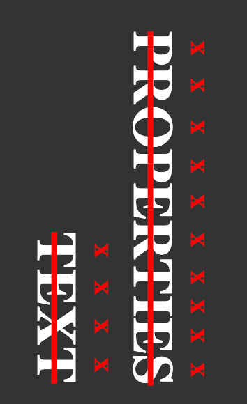
let's say we want change the direction of the text we have one property writing-mode which we can be uses to make text vertical vertical-rl or vertical-lr . text-decoration for creating line on texts and text-emphasis for symbol.
Now let's go to wraping texts in codepen.
.wraping-text {
  letter-spacing: 5px; // character space
  line-break: anywhere; // how line should break
  word-spacing: 10px; // space between letter or word

  white-space: nowrap; // all in one line
  white-space: pre; // it will display extra white spaces in html
  white-space: pre-wrap; // white spaces which are wraped
  white-space: pre-line; // white spaces with new line same as html but space between words is stripped
  line-break: initial; // word-break does not work with anywhere it will still
  break the line undefined.
  word-break: keep-all; // same as default
  word-break: break-word; // onsly break the words that does not fit on edge.
  word-break: break-all; // break all words to fit the container
}
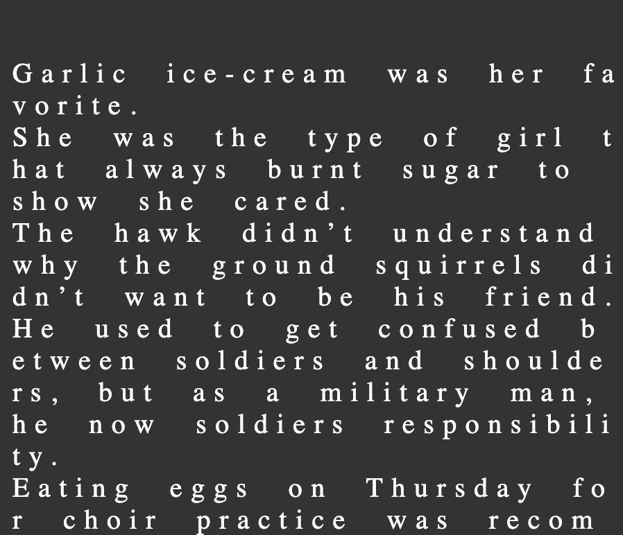
as you can see from the comments from right side you can properbly get the gist of how thigs works but we are going to talk about white-space and word-break.
white-space is used how text should make spaces on text and should extra spaces on the words to be added or not.
white-space: nowrap
this will put all the text on one line. but we don't want mostly all the text on one line unless we want create ellipsis but we will come to that later.
Now what if we want to give spaces same as we put them in html or If we want to force the browser to display those line breaks and extra white space characters then we have you guessed it pre values. you can choose depending on the value you pass what kind of look we want to give based on the html provided text. try in the code pen and see the changes.
now on word-break is used for how text should break in wrapping. you can see in the above code snippet line-break: initial it is because line-break is used for how to draw line between long paragrah. with line-break , word-break will not work.
there is alos overflow-wrap which is used when we have long word in the paragrah and we want to desicde wheather we want to let container overflow or break that work.

i am sure use have saw this kind of UIs and there is just over property with text wraping. it's called text-overflow and there are two values that we can pass on first is clip which is default it will cut the element based on overflow value.
but want we set text-overflow: ellipsis; it will create above effect. note that if we want above effect to work we have to pass overflow value other than global value and scroll will create a scroll.
There are other filed but some are deprected or reacetly new to be used in as norm. now let's talk about shodows.
shodows
text-shadow
let's start with text-shadow we can use it make a shadow effect around texts. look into codepen.
text-shadow: #fc0 20px 19px 0; // color x-offset y-offset blur-value

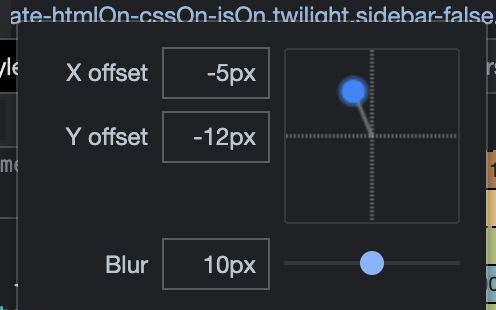
so shadow will just create a another text on top of exisiting one and than we can use x-offset and y-offset to set the shadow text position. we also have blur which will blur shadow text and spread the color.
text-shadow: #fc0 0px 0px 10px;

we can set mutiple shadow's by spearting with ,
text-shadow: -13px -13px 3px #ff0000, 16px 16px 5px #0000ff, #fc0 20px -9px 0px;

I would personally recommand using google dev tools. if click on the text-shadow in dev tools you will get below model which you can use to change shadow reactivly.
box-shadow
i sure you have heard of Neumorphism in UI world.
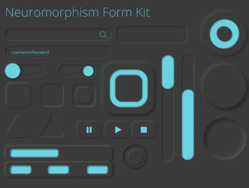
This can be achived by just one shadow proprerty and other css tools which is box-shadow.
box-shadow: red 0px 0px 10px 5px; // color x y blur spread

it's works similar way text-shadow but we have few more values that we can pass. there is spread property which used to spread the color wide.
box-shadow: inset red 0px 0px 10px 5px;
it will create shadow inside the box rather than outside of the container. same as text-shadow we can pass mutiple color with "," opertor.
box-shadow: inset red 0px 0px 10px 5px, blue 0px 0px 10px 5px;

Now that it i now you may thinking how do we make Neumorphism like above in the image i going to explain some effects and i have added more on codepen you can try out.
But if don't want to burn your brain just want a simple way to create a Neumorphism there is tool that will make your life quite easier neumorphism.
box-shadow: #06182c66 0px 0px 0px 2px, #ffffff14 0px 1px 0px inset;
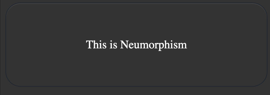
I have used #06182c66 beacuse it's better to combine value with alpha. you can replace #06182c66 with black and it will create thick layer of boder.
Now as for second value it's a light color with somewhat 50% alpha and 1px Y with inline which is the resone for upper light border. you should remove the alpha for better visual.
box-shadow: #06182c66 0px 0px 0px 1px, inset #06182ca6 0px 4px 8px 0px, #ffffff14 0px 1px 0px inset;
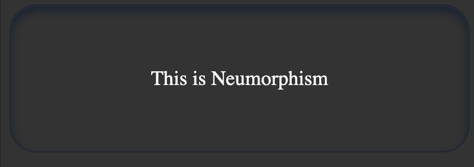
If want to more of pressed kind of effect we just need to pass inset the surrounding shadow value which in this case is #06182c66 0px 0px 0px 1px.
