BoxModal
Taking refrence from mdn docs when laying out a document, the browser's rendering engine represents each element as a rectangular box according to the standard CSS basic box model.
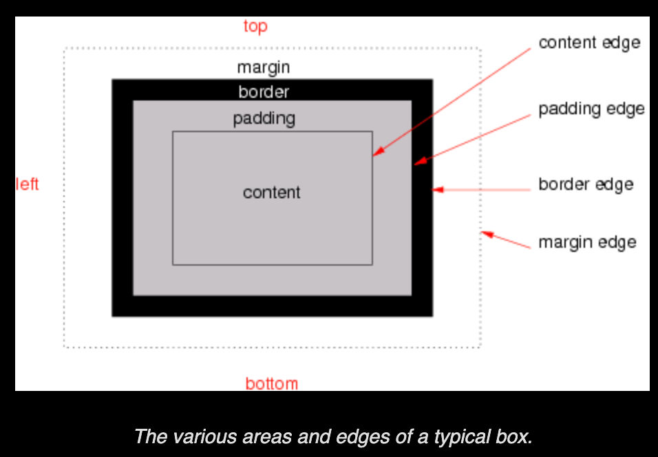
let's just get thorugh basic defintaions and working of margin, padding, border, and outline. you can check out the codepen i have cerated for this blog you can follow along.
CodePen: https://codepen.io/Wolfie12/pen/MWVQYNe
Margin:
Margin area will create sparete area between two neighour elements.For the most part it just going to find closest element and create margin area accorddingly. If there is neighbor element can be also parent. Also there something called margin collesping will happen where margin diffrence between Margin-1 and Margin-2 will be 10px rather than 5px + 10px but later on that.
.margin-container{
  margin:20px;
  & > * {
    margin-top: 5px;
    // Margin Collapse will happen
    margin-bottom:10px;
    outline: 2px solid blue;
  }
}}

Padding:
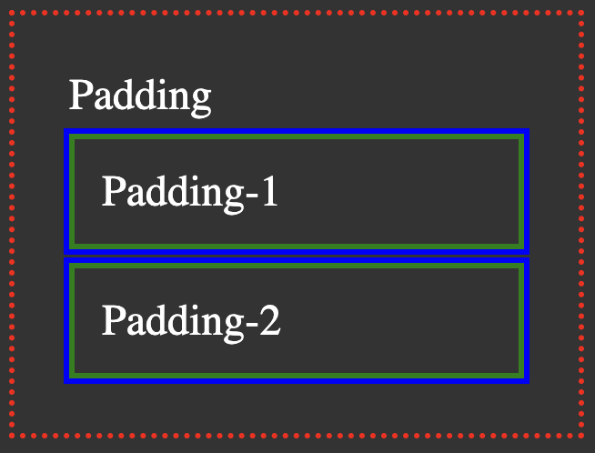
Padding will extened the area of the content and make the area larger. it's works similar way margin but it will expand the content area.
.padding-container{
  padding:20px;
  & > *{
    margin-top:5px;
    padding:10px;
    border: 2px solid green;
    outline: 2px solid blue;
  }
}
Border:
it will create the border around the padding if provided or content width area.Its dimensions are the border-box width and the border-box height. Note : If the box-sizing is set to border-box than we can set border area by width and height proprties. Link : Box Sizing.
Outline:
An outline is a line drawn outside the element's border. as you can see above outline will create around border of element if provided. syntax is similar like border.
The box-sizing property sets how the total width and height of an element is calculated.
There Two property that we can set one is Border-Box and other is content-box which is default.
Box Sizing
The box-sizing CSS property sets how the total width and height of an element is calculated.
Content-Box
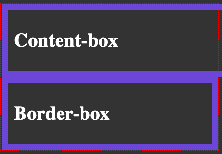
If the Box sizing is set to content-box than first width and height assign to a element will be only applied to the content and when padding is appied it will take extra space which will be add to existigin value of the width and height .
.Content-box{
  box-sizing: content-box;
  width: 100%;
  border: solid #5B6DCD 10px;
  padding: 10px;
}

In exmple above the Padding of 10px will cross the width container of 100% and add extra of 10px space of paddding.
Border-Box
Border-box will Create total of width of element with padding and border added. box-sizing: border-box is the default styling that browsers use for the table select and button and few others.
.Border-box{
  box-sizing: border-box;
  width: 100%;
  border: solid #5B6DCD 10px;
  padding: 10px;
}
It is often useful to set box-sizing to border-box to lay out elements. This makes dealing with the sizes of elements much easier, and generally eliminates a number of pitfalls you can stumble on while laying out your content. On the other hand, when using position: relative or position: absolute, use of box-sizing: content-box allows the positioning values to be relative to the content, and independent of changes to border and padding sizes, which is sometimes desirable.
Margin Collapse
As we saw in prevoius artical for Css Box Modal there is s finominal call margin collapse happens on certain cases. When Two elements Margin Tops and Margin Bottom became part of another it's called margin collapsing.
.margin-container{
  margin:20px;
  & > * {
    margin-top: 5px;
    // Margin Collapse will happen
    margin-bottom:10px;
    outline: 2px solid blue;
  }
}}
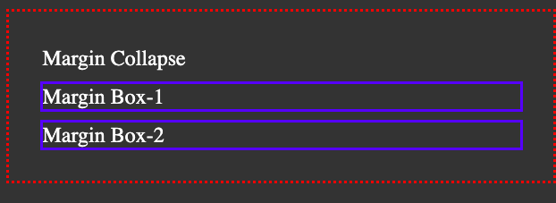
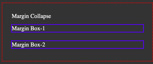
The Margin diffrence between Margin-1 amd Margin-2 should be 15px= 5px+10px but it will be only 10px. which is maring collapsaeing. the margins of floating and absolutely positioned elements never collapse.
we can solve Margin collapsing by setting the parent's element Display:flex or Display: grid or setting padding for top or bottom to parent.
Link to FlexBox Article.
.margin-collapse {
  display: flex;
  flex-direction: column;
  margin: 25px;
  & > * {
    margin-top: 15px;
    margin-bottom: 10px;
    // margin between Box-1 and Box-2 will be 35px = 15px + 10px
    outline: 2px solid blue;
  }
}
Taking refrence from MDN Docs Link
Margin collapsing occurs in three basic cases:
1] Adjacent siblings As you can see from above exmple two elements are Adjacent siblings so margin collapseing has occured for second elements top margin and bottom margin for First element.
2] No content separating parent and descendants If there is no border, padding, inline part, block formatting context created, or clearance to separate the margin tops and margin bottoms. let's take a look by removeing Margin text in above exmple.
.margin-collapse {
  margin: 25px;
  & > * {
    // Margin Top of first will collpase with parent 25px
    margin-top: 15px;
    margin-bottom: 10px;
    outline: 2px solid blue;
  }
}
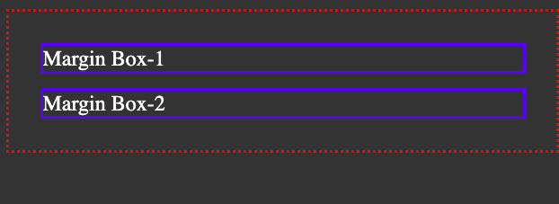
When there is no content between parent and child the margin collapse will take place as shawn in above margin box-2 will have 15px margin-top but Maring Box-1 will have 15px as well but it will be part of parent's 25px margin.
3] Empty blocks If there is no border, padding, inline content, height , min-height to separate a block's Margin then its top and bottom margins collapse. if we put padding in parent class in above expmple the margin collpase will be removed.
.margin-collapse {
  padding-top: 1px;
  margin: 25px;
  & > * {
    // Margin Top of first will not collpase with parent 25px because there is
    // padding of 1px
    margin-top: 15px;
    margin-bottom: 15px;
    outline: 2px solid blue;
  }
}
Note : On this Blog i have used SCSS which is preprocessor for CSS. it give some easy way of writing css. i have only used nesting for easly writing CSS but if you want to learn more or don't understand the sytanx here is Link for basic of SCSS.
Reach out at me on Twiiter.
